

Paw & Order, Creating a Cover
Author/Illustrator Jason Platt shows the process of creating the cover art for his middle-grade graphic novel, Paw & Order Vol. 1: The Grilled Cheese Caper.
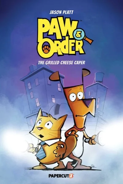
Paw & Order Vol 1: The Grilled Cheese Caper by Jason Platt
Book covers are fascinating to me.
Before anyone flips a book to the back cover to read what the story is about, or even who the characters are, the first thing they see is the book’s cover. It is, essentially, the movie poster for the adventure you, as the reader, see. It gives you a peek at what kind of adventure you’re about to go on. Beyond the title and the author name, the cover art will give you what kind of mood the book might give you.
The cover might tell you if the book is a drama, a period piece, a comedy, a romance, science fiction, or even a mystery. The book’s cover is the first promise the book gives you on what kind of story it is. It is usually the first reason anyone picks the book up in the first place.
And while the inside of the book (the story) might take an author a year or so to construct by the author, and shaped by their editor, the cover is handled a little differently. We’ve all heard the phrase, “Don’t Judge a Book by its Cover” before. While it’s a true statement, the cover is the first bit of attraction has to it. The cover can entice you and lead you to pick it up. Lead you to turn it around and read the back to find out more. It has to tell you what the story is about without spoiling anything.
In many cases, an author doesn’t have much say in how the cover will look. Even Stephen King once talked about the cover of his book, “Bag of Bones,” saying that the cabin on the cover was the artist’s interpretation of it, and not what he saw in his head.
But in my case, as the author/illustrator of my books, it’s different.
I don’t just get to come up with an idea for it. I get to develop it and see it through.
So today, I want to show you the steps I took in creating the cover for Paw & Order Vol 1: The Grilled Cheese Caper.
So… here we go.
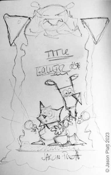
Pencil Sketch of Paw & Order Vol 1: The Grilled Cheese Caper by Jason Platt
1: When it comes to creating a book cover, I never want to assume that my idea will be something that my editor and publisher are looking for. It’s a collaborative process. So you want to start out small with a quick sketch.
Even in the original sketch I made you can see how similar it is to the final, can’t you? But you can also see some differences too. Purrlock and Marlowe are still at the center, shining their flashlights off to the corners of the page, and looking a little scared. But I also thought it would be fun to have the gooiness from a grilled cheese sandwich framing them both. And, the mysterious figure up at the top. Which, if you’ve read my book, is Meowiearty.
But this was just the idea phase. The sketchy idea I had and wanted to develop further. This sketch was too sketchy and wasn’t what I sent to my editor. That leads to the next stage.
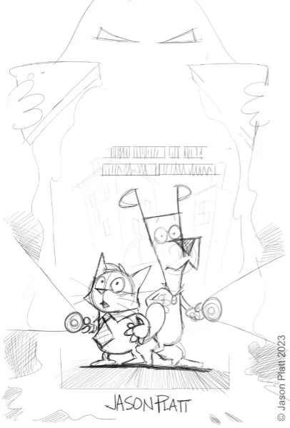
Pencil Rough of Paw & Order Vol 1: The Grilled Cheese Caper by Jason Platt
2. I took my sketch it and cleaned it up a little bit. At this stage, I’m not looking for it to be finished by any means, but I want to make sure that my ideas are cleaned up and understood.
So I brought it in and cleaned it up at the final size.
As you can see, the original ideas I had in the original sketch are all here. The only real difference I made is changing Meowiearty into a mysterious hooded figure holding the halves of the sandwich. Having Meoweiarty up at the top might be too suggestive. The blocked scribbles I have above Purrlock and Marlowe’s head are where I signify where I saw the titles and subtitles.
This rough pencil sketch is the version I turned in.
It got the green light.
So… on to the next stage! Painting!
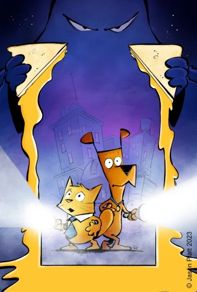
Tightened version 1: Paw & Order Vol 1: The Grilled Cheese Caper by Jason Platt
3. It’s funny for me to look at this version now.
The only main difference I see (and this is mostly with the main characters) is that this is before Marlowe has his red collar, and before he has his white belly. With his orange fur, I originally saw him with a blue collar on. Blue is a complementary color to orange, so it was an easy choice to go that direction.
BUT….
There was some concern that with the blue collar, he might look a little too much like another crime-solving K-9 out there. Even though Marlowe isn’t a Great Dane (I’m not exactly sure what breed Marlowe is), I didn’t want to have any confusion. Marlowe is certainly one of a kind!
This is the first version I was playing with. While I liked how this one was headed. I wanted to see where it could go.
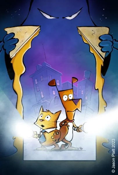
Tightened version 2: Paw & Order Vol 1: The Grilled Cheese Caper by Jason Platt
4. Ah… There’s the Marlowe I know!
In this second version, you can see how similar it is to the first one (above), but how I took it and made it a little moodier. I loved how the bright yellow cheese framed them in the first one, but we felt like it might have been pulling focus a little too much. Even though the cheese frame is still here, it isn’t as prominent. I also loved adding a little bit more fog into the scene. Nothing says spooky like rolling fog!
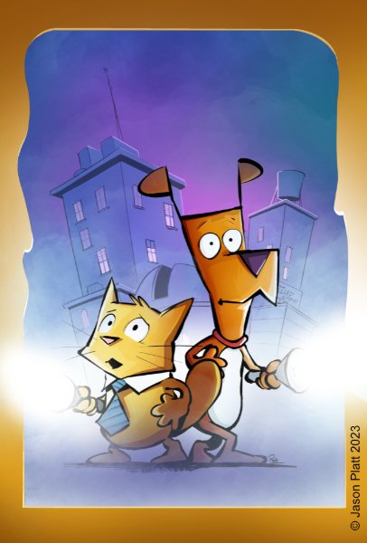
Final Version 1: Paw & Order Vol 1: The Grilled Cheese Caper by Jason Platt
5. Right away, you can see what’s different here.
As much as we liked the idea of the mystery figure with the grilled cheese sandwich in their hands, it took too much focus from what we really wanted to see, our heroes!
For the longest time, we kept this cheesy frame in the design. But the closer we got to publication, we decided to add one more thing to it. Or… take something out.
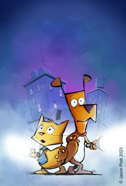
Final Art for Paw & Order Vol 1: The Grilled Cheese Caper by Jason Platt
6. And finally, here is the final art for Paw & Order Vol 1: The Grilled Cheese Caper.
Obviously, we decided that, as much as we liked the cheesy frame, it had a stronger design without it.. Plus, the fantastic design of the Paw & Order logo really shines against the deep blue/purple night sky.
You might ask yourself, does it always take this many versions to come up with a cover? Sometimes, yes. Sometimes you get lucky and get the idea out in one take. But sometimes you don’t know what you want until you see something that isn’t working for you. And sometimes those moments take time.
Do I ever look back at some of the other versions and wish they were the cover? Not really. The other versions are the just part of the process of the cover’s journey. I never feel like I wasted my time with them, because doing them made me realize the direction it needed to go. But they are always fun to look at.
But I wasn’t alone in this journey. I had a talented editorial team behind me who had helped get the cover to this point. And when you have a great team behind you, you feel like you can do anything.

Creating the cover for Dance Disaster

There are a certain number of challenges when creating the cover for a book. When you’re both the author and illustrator for a graphic novel you also have the luxury of being able to make the cover exactly as you’d like it. With the exception of comic book covers, usually the same artist that does the interior art will also do the cover art as well.
Prose novelists don’t usually have this luxury. They might have an idea that they’d like to see for the cover, and their ideas will certainly be heard, but ultimately the cover design will be determined by the editor, designer, and publisher.

Covers for Middle School Misadventures and Middle School Misadventures: Operation Hat Heist!
With my first two books, Middle School Misadventures, and Middle School Misadventures: Operation: Hat Heist!, Newell was alone on the cover. And while I wanted to replicate having Newell be the focus (he is the hero of our story after all) I wanted to incorporate his friends in the cover too. While we follow Newell throughout each story, his friends who make up the ensemble, are just as important. So I made sure that they were seen too.

Early pencils for the Middle School Misadventures: Dance Disaster cover
The working title for Dance Disaster was Wallflower Jinx. But it wasn’t a solid title, as Newell—at first—is super excited about going to Garfield’s school dance. So it wasn’t like he was on the sidelines of the dance or anything.
But design wise, you can see right off, that we are near the target of what the final design will be. Even now, I still like image of Newell’s back turned to us as he watches his friends cut a rug on the dance floor. But we decided to go with the pencil sketch on the right.
So next was the next phase: Inking and coloring.

Dance Disaster cover art, version 1
This first version wasn’t entirely a train wreck or anything. But even as I was working on this first attempt I knew it was far from what we were all looking for. Even though Newell’s posture works with the emotional struggle he goes through in the story, it was lacking a certain amount of energy that it was needing. And while I was overall happy with the color palette, the values had a dullness about them. I knew I needed to give them a little more life.
There were also three different levels of depth that I was working with, and all three needed to hold their own independently. 1) The background: This was a school dance, so I wanted to be sure I showed other kids having fun too. While I wanted to incorporate them I also needed to make sure they weren’t competing with the stars of the show. And I needed to make sure that they disappeared into the background. 2) The middle: Right smack-dab in the middle of it all are Newell’s friends. With the exception of Skyler, who is lumped in with the first group (foreshadowing maybe??), I wanted to be sure that they were in clearer focus from the crowd, but not pulling the focus from Newell. 3) The Front: Front and center stands our main character, Newell. I knew that by looking at this version he wasn’t dynamic enough here. Even though his hierarchy was front and center, his friends were more fun to look at.
I had some changes to do.
But you got to start somewhere right? You can’t solve a problem until you know there’s a problem to solve. So even though this was a setback, it was a setback leading in the right direction. I could see what was working, and what wasn’t.
So I took what my editor and I liked about this version and moved forward.

Dance Disaster cover art, version 2
You can tell right away that things are moving in the right direction here in this 2nd version. Along with beefing Newell up, I also added more contrast with the colors. I also pushed Newell’s friends back just a touch giving Newell all that more focus.
Even though I was pleased in the direction version 2 was headed, I knew it wasn’t the be all end all. It was time to move on to version 3.

Dance Disaster cover art, version 3
With version 3 you can see how incredibly close we are to the fished cover art. In Dance Disaster, Newell is originally excited to go to the dance because he’s able to reprise his famous dance move, The Shake and Slide. And we thought we’d incorporate it into the cover and it was exactly the right amount of energy we were looking for.
The only thing we weren’t sure about were the glasses or not. The concern I had with having them on was that they made Newell look older. Which I guess was successful since that is what Newell’s after in the story (esp. since he’s wearing a tie too). So we went back and forth on whether to have the glasses on or not.
Eventually, we decided to have them off. But, as you can see by the final art, we ended up having them flying off of him mid-dance.
The only thing that I haven’t mentioned is that whenever I adjusted the position of Newell’s body (or even the size of it), I also had to adjust the crowd in the background. One of the reasons why Newell’s left arm (in the cast) is angled up a touch is so we have a clear view of Lilly, Max, and Skyler dancing in the background. There were many times I just wish I could have called out to them and said, “Okay, Lilly, Max, Skyler? Yeah, you three—can you all just move slightly to the right? That’s perfect. And now Collin and Clara? Can you inch a touch to the left? Great! And Newell, just angle your arms just a little bit—stop!—that’s perfect! Okay… hold still everybody and… * shutter click * got it!”

Dance Disaster, final cover art
And here is the final art for the cover for Dance Disaster!
They say that you should never judge a book by its cover. While that’s true, there is so much beyond throwing an image onto a book and slapping the title on it. There are so many things to think about when designing a cover like this. Between the front and back cover of a book is the whole story. But the cover is the first thing the audience sees. It’s where their first spark of interest comes from. It’s something that you want to be proud of.
And I’m so proud of it.
-- Middle School Misadventures: Dance Disaster is available for pre-order right now and comes out April 5th to your favorite bookstore!